The night of the US presidential elections is the Olympics for TV news outlets. Every four years, media companies race to report results to millions of viewers worldwide.
The stakes were even higher this year. Set against the backdrop of a surging pandemic, the analog circus of ballot-counting in battleground states turned what was typically a one-night affair to a five-day nail biter. The usual high octane television news coverage—exhilarating in past years—felt onerous. Numbers! Maps! Projections! Fraud?! Recount! As the days dragged on, I found myself Googling: “ASMR election coverage.”
I was hardly the only one on edge. A recent survey by the American Psychological Association revealed that 70% of respondents identified the 2020 elections as a significant source of stress.
Except for the Telegraph’s somnolent dissection of the UK 2019 general elections, my internet search for a calming elections report turned futile. Every news broadcast it seemed, even the distinctly sober public TV programming, was designed to raise our blood pressure.
The razzle-dazzle of election coverage reflects how entertainment is a necessary ingredient of political news broadcasts. It’s a phenomenon we see play out now in the drawn-out legal drama over certifying the US elections, with the breathless coverage of president Donald Trump’s flailing efforts to stay in office driving ratings. This formula is a vestige from the early days of election broadcasting, when projections were shown on canvas screens outdoors, and funny cartoons flashed between returns to keep crowds “in good humor,” as the New York Times described in its 1872 report. Somehow, the notion of amusement evolved into the frenetic, tech-heavy visual spectacle we see today. But during a historic year when millions of viewers are seeking clarity and reassurance above all, does this formula still work?
A brief history of election broadcasts
Urgency is built into the design of the election night broadcasts.
Long before round-the-clock news, media companies devised ingenious ways of broadcasting election results. In his PhD dissertation, Ira Chinoy, an associate professor of journalism at the University of Maryland, explained how voters gathered at newspaper offices to wait for election returns. When crowds got bigger, the results were projected on a large piece of canvas using an early projector illuminated by a hot calcium brick called the stereopticon also known as a “magic lantern.”
To reach even greater masses in the late 1800s, several newspapers in New York, Chicago, Boston, and San Francisco installed searchlights on top of their office buildings. Ahead of the elections, they published a guide on how readers could interpret the light beams in the sky.
Chinoy describes how the New York Times relayed results of the 1904 elections:
Steady lights to the east or west would signal the victor in the presidential contest—west for the Republican incumbent, Theodore Roosevelt, or east for his Democratic challenger, Judge Alton Parker. Steady lights to the north or south would flash the outcome of the governor’s race. A light to the west moving up and down would announce a Republican Congress, and a similar movement of the light in the east would mean the Democrats had achieved a majority.
In doing so, readers “can don his negligée and from an advantageous window in his flat or his house ascertain the important results,” as the Times described.
The first commercial radio broadcast in the US was dedicated to covering the 1920 presidential elections. Engineer Frank Conrad announced a landslide victory for republican William Harding to the 100 listeners tuned in to Philadelphia’s KDKA station.
Televised election coverage began in the 1950s and dazzling computers were part of the production set since the beginning. The star of CBS’s 1952 election night broadcast was a $600,000 “electronic brain” called Universal Automatic Computer or UNIVAC. For the first time, a machine analyzed election returns and was able to predict winners even before polling sites on the west coast closed.
“This is the face of a UNIVAC,” journalist Charles Collingwood explained, referring to the piano-sized circuitboard festooned with blinking lights. “This is not a joke or a trick. It’s an experiment and we think it’s going to work.” (But there was a bit of trickery involved. The UNIVAC on the set was actually a prop, the real computer mainframe was many times larger and was in the maker’s factory in Philadelphia.) The UNIVAC accurately predicted a landslide victory for Republican candidate Dwight Eisenhower but the news anchors doubted its hyper-efficiency and delayed reporting the results.
Not to be outdone, NBC had a smaller (but “sexier,” Chinoy notes) computer it called Mike Monrobot that year. In the press release, the gizmo was introduced as an amorous genius—it was the Mad Men era after all:
He’s fond of pretty girl secretaries, who can be readily trained to operate him, but on election night Mike will have a beautiful woman Ph.D. for his companion. The learned doctor will establish the mathematical equations necessary to figure the trends of various election races and stuff this information into Mike’s maw. A brief digestive whir and tap-tap-tap at 600 figures a minute and out will come the answers typed automatically…
This impulse to dazzle audiences with new technology on election night continues today. In fact, the US presidential elections is a big driver for innovation, explains Petter Ole Jakobsen, the co-founder of Vizrt, a computer graphics software used by most broadcast studios around the world. “On election day, you [news organizations] got extra budget,” says Jakobsen, a former news editor for Norway’s TV 2. “This was really a time when you could experiment.” High definition video screens, interactive whiteboards or “magic walls”, and sophisticated screen graphics all debuted during election broadcasts.
Jakobsen says he’s impressed with how media companies have learned to be more discerning about their use of technology. Holograms, which CNN famously used to embellish their 2008 election coverage, led to the refinement of sophisticated telepresence tools. (Technically, CNN didn’t broadcast an actual hologram, but a “hologram-like” effect.)
A taste for bombastic effects
News is a storytelling medium. The technology, the data visualizations, and the architecture of news sets are all carefully orchestrated to help journalists unpack the complex US election system to a wide audience “Elections are so data-driven by nature,” observes Michael P. Hill, founder of the broadcast industry trade publication NewscastStudio. “The end goal is to make it easier for the viewer to understand.”
The frenetic quality of on-air news productions today speaks to the audience’s sensibility, says Hill. He explains that there’s a belief in the news industry that today’s viewers—especially millennials of the so-called “multitasking generation”—can handle more information on screen based on how they consume media. “We’re living in a time when people are refreshing their Twitter screens every five seconds,” Hill notes.“It’s all about enhancing the storytelling. Storytelling today is no longer just Uncle Walter [Cronkite] sitting there and reading a story to you. I’m sure you can debate whether that’s better or not.”
There’s a belief in the news industry that today’s viewers—especially millennials of the so-called multitasking generation—can handle more information on screen based on how they consume media.
Emmett Aiello, chief creative officer of the sought-after production design firm Clickspring, says that media outlets remain obsessed with augmented reality (AR). “It’s become an all arms race in terms of who did it first,” says Aiello, who oversaw the design of NBC and CNN election news sets this year.

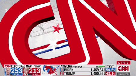
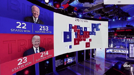
ABC has an AR electoral college map that leaps into the center of their arena-like set. NBC had a spiffy White House graphic ushering in the vote tally. CBS, who built a new studio in time for election night, debuted a new presidential race map and a senate floor graphic. Fox News, the top rated broadcast this year, also displayed maps and leaderboards in AR.
And it’s not just in the US. France’s TF1 had a full-sized AR version of Joe Biden and Donald Trump appear at their show.
Dubai’s Al Arabiya Network produced the world’s most elaborate augmented reality set for the US elections. Designed by Clickspring, AR projections of Washington landmarks were interspersed with dazzling data visualizations that seemed to dwarf the presenter.
As on-screen graphics become more complex, the physical architecture of sets become simpler explains Aiello. Because graphics can now be digitally projected to blank surfaces, built structures can be simpler and more modular. “If you add too much, you’d be competing [with the graphics],” he says. With augmented reality, networks also save time and money by repurposing sets for various big events. ABC for instance, used the same set for a Juneteeth special and the SpaceX launch in May.
A sobering warning
As networks race to out-do one another with bigger, flashier productions on election night, doctors warn that overstimulating audio-visual content can have adverse effects on the viewers’ health. Graham C.L. Davey, emeritus professor of psychology at the University of Sussex tells Quartz high tempo noises and busy graphics can directly increase stress and even cause depression for some individuals. “Some people will interpret this increased arousal as exhilarating, while others will interpret this arousal in a negative way and find it anxiety provoking,” Davey explains. “Many people with existing anxiety problems already have a bias to interpret increased arousal as threatening rather than exhilarating.”
Bold graphics, for instance, can have a physical effect on viewers. Seeing strobe lights at certain frequencies (or gifs) can trigger seizures for people with photosensitive epilepsy.. The UK’s government regulatory board OfCom restricts showing media (pdf) with fast flickering lights, bright flashes, and certain stripe patterns.
During a time when many are maxed out with the compounding stresses of a global pandemic, racial tensions, an economic crisis, and a warming planet, could it be time to challenge existing templates of news productions? Aiello sees a breaking point in the horizon. “I can’t see it becoming any more complicated, unless we get into the virtual world when stuff is projected in your room,” he observes. “There’s got to be a finite ceiling to the amount of information people can absorb. In all art, things hit a critical mass and things are pushed back in the other direction.”